

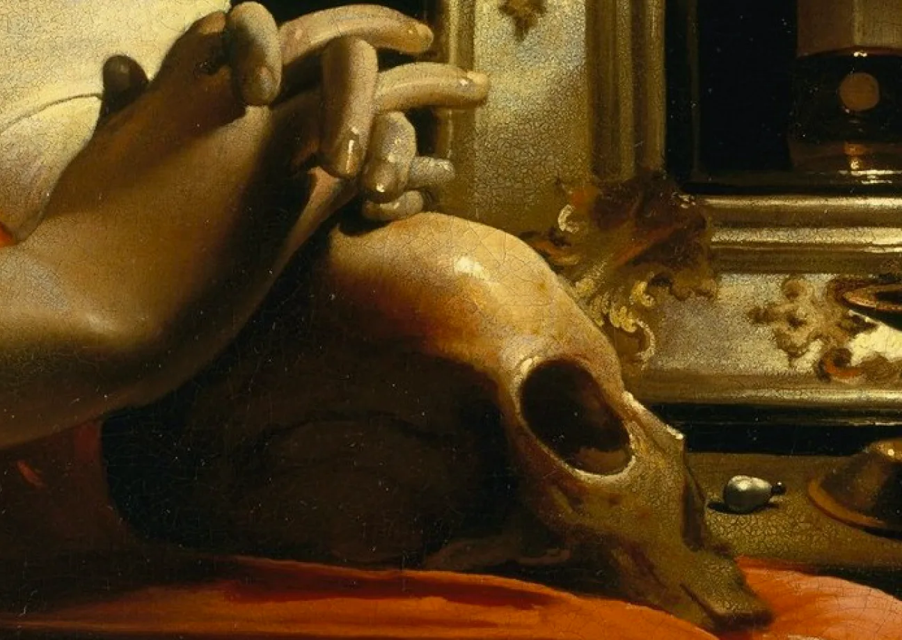

In an age where aesthetics are often dictated by fleeting trends and mass production, Catholic branding faces a challenge: how to remain both authentic and beautiful without succumbing to superficiality. Roger Scruton, a fierce defender of beauty in art and architecture, argued that authenticity is essential for meaningful design. His insights offer a compelling case for why Catholic branding should prioritise traditional, handcrafted, and meaningful visual expression over passing fads and commercialised aesthetics. This article explores how Scruton’s philosophy can guide Catholic brands to embrace genuine beauty and reject the allure of artificiality.
The Problem with ‘Fake’ Aesthetics
Modern branding often prioritises what is immediately appealing rather than what is enduring. In the secular world, companies capitalise on trends, using bright, eye-catching visuals that provide instant gratification but lack depth. This same approach can be found in some Catholic branding, where over-stylised graphics, generic stock imagery, and trendy fonts replace more timeless and meaningful design choices. The result is a loss of identity, where Catholic institutions and organisations begin to blend in with the visual language of commercial advertising rather than standing out as bearers of truth and tradition.
Scruton warned against the abandonment of tradition in favour of convenience. He criticised the rise of mass-produced art and architecture, arguing that beauty must be rooted in craft, intentionality, and respect for heritage. These principles are just as relevant in Catholic branding as they are in sacred architecture. When a Catholic organisation’s visual identity leans too heavily on contemporary, disposable aesthetics, it risks losing the depth and dignity that should define it.
The Role of Beauty in Catholic Branding
Catholic branding, whether for parishes, dioceses, schools, or apostolates, should be more than functional—it should be formative. Beauty has the power to draw people into deeper reflection, to communicate truth beyond words, and to inspire faith. A well-designed Catholic brand should not merely seek to attract attention but should reflect the transcendent. The use of classical typography, rich symbolism, and refined colour palettes can elevate a brand from being just another organisation to being a tangible representation of the Church’s mission.
Scruton’s view of beauty as an essential part of human flourishing reminds Catholic designers that their work is not just about aesthetics but about meaning. Every design choice should be intentional. Handcrafted lettering, traditional iconography, and well-composed layouts all contribute to an authenticity that connects viewers to something greater than themselves. Just as a cathedral’s beauty draws worshippers upward, Catholic branding should lift the soul, reinforcing the sacred rather than diluting it.
Prioritising Traditional and Handcrafted Design
In the rush for efficiency, modern branding often sacrifices craftsmanship. Logos are created with generic templates, religious images are sourced from impersonal stock libraries, and marketing materials are designed for momentary impact rather than lasting impression. But authenticity requires effort, and Catholic branding should embrace the discipline of crafting something that carries intrinsic value.
Hand-drawn elements, calligraphy, or illustrations rooted in the Church’s artistic tradition add depth to branding materials. These choices connect the present to the past, reinforcing the sense of continuity and heritage. Likewise, classical artistic principles—proportion, balance, and harmony—should guide Catholic design. A logo, a website, or a printed publication should feel timeless, evoking the same sense of reverence that one experiences when encountering a well-preserved manuscript or a stained-glass window.
Resisting the Urge to Chase Trends
Trends will always come and go, but Catholic branding must transcend the ephemeral. Scruton’s critique of modern aesthetics highlights the dangers of sacrificing long-term beauty for short-term appeal. Bright, trendy colours and minimalist, hyper-modern typography may seem fresh today but will feel outdated tomorrow. More importantly, such aesthetics may fail to resonate with the deeper, spiritual longing that Catholic branding should fulfil.
The Church is built on a foundation that extends beyond any particular cultural moment. Catholic branding should reflect this reality by choosing visuals that endure. Resisting the pull of trendy design does not mean refusing innovation—it means approaching it with discernment. Advances in digital media and graphic design can be valuable, but they should be used in a way that serves beauty rather than replacing it with convenience.
Conclusion
Roger Scruton’s advocacy for beauty and authenticity offers a valuable framework for branding. Rather than conforming to the disposable aesthetics of the modern world, Catholic designers, artists, and communicators must seek to create something meaningful, something that reflects the dignity and depth of the Church’s mission. By prioritising handcrafted elements, traditional symbolism, and timeless design principles, Catholic branding can be a true witness to the transcendent. In the end, beauty is not just about looking good—it is about revealing the truth of what is sacred, drawing the soul toward God through the harmony and order of authentic design.

Written by
Emily Toma · Creative Director
Emily Toma is the Creative Director of Arcadia Digital. She leads the agency’s design and creative work, shaping how its clients look and feel online.
